Students were asked to take existing brands and re-imagine their logos as an exercise in motion design and branding.
Ideation and Iteration
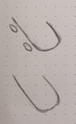
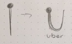
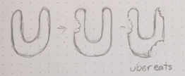
I began by research Uber's current and previous brand iterations, and used my findings to help define the my design constraints. As a company that emphasizes transportation motion design fit nicely into the established values of the company. In my ideation process, I explored travel and connection for my ideations of Uber's primary logo. For their sub-brand, Uber Eats, I focused on food and utensils to inspire my ideations. As I began translating some of my concepts to the screen, I explored how motion impacted the viewer's experience of the logos, and used that to inspire the final designs.


Final Products
The final logos displayed Uber's ridesharing service and their food delivery service through simplistic imagery and motion. The first logo is reminiscent of the movement of cars driving and parking, while the second logo focuses on a person looking for a ride and the solution to their question. The third logo is for Uber Eats, and demonstrates that through the munching of a cookie.